A tool like Aqua Data Studio provides a rich canvas for creating data visualizations. While these charts, graphs, etc. can be eye candy, without proper context they are nothing more than pretty pictures. It is important to create the right perception. Perception is the process by which the human brain takes in external stimuli from its environment. In plain English, perception is the process by which the brain “sees” information in a dashboard.

Perception involves subconscious processing of visuals. The brain has very limited capacity to process all the information. Things like text and numbers cannot be processed pre-attentively. They require conscious focus to process. Whereas things like position, color, alignment, size and shape can be processed subconsciously.
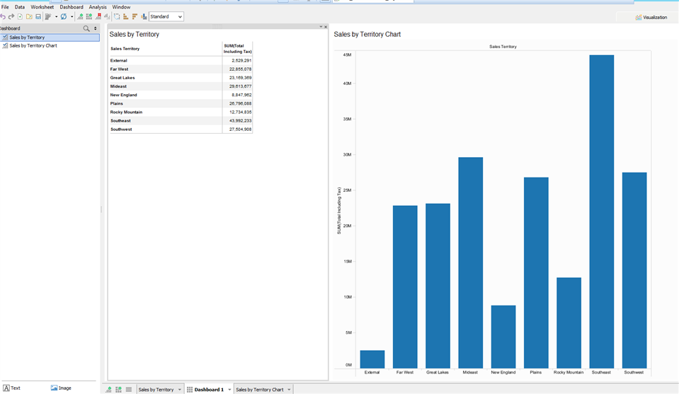
Here is an example of two ways of presenting the same information. It displays “Sales by Territory”. If we are looking for the territory with the highest sales amount it takes a few seconds for your brain to process. As you can see the bar chart readily displays the desired information whereas we have to visually search and process the data table to find the information.
Best Practices
So, what’s the deal then? The more pre-attentive processing we can bring to our visualizations the more “intuitive” they become. Good data visualizations are built this way. All of this is to say that there are best practices, that if followed will aid in building intuitive dashboards and visualizations.
Have a Methodology
Have a plan/process for design requirements, gathering data, design and release. Without a methodology you don’t get continuous improvement and consistent quality. This methodology could be something like:
- Conception – Identify your audience (main question, theme, etc.)
- Visualization – Primary views, supporting views, layout
- Finalization – Interactive elements, look and feel, revisions, final
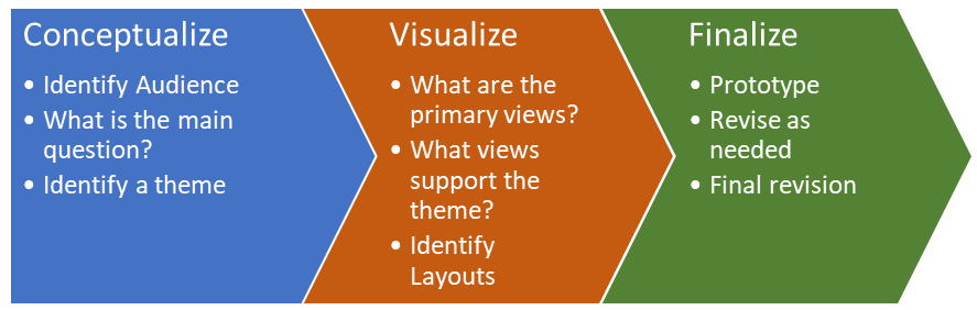
This allows us to identify our desired audience through several questions. We can create a theme to help with the questions that audience might want to answer. Then we can start to put together effective visualizations and views of the data. Finally we create prototypes to show our target audience and refine to meet their needs.
This methodology follows the old adage, “Without a plan we have a plan to fail”. I have seen way too many projects go over budget or fail because an adequate methodology was not followed.
Know Your Audience
Not everyone sees the same visualization in the same way. For example, a product line manager is going to see profitability in a different way than a Chief Financial Officer. You need to identify and know how your audience perceives data.
Define Resulting Actions
Identify what actions your audience might take after viewing your dashboards. For example, what action would you expect a sales manager to take after viewing that sales in a particular region was down based on projections. This will help determine other visualizations that might provide insights to aid in decision making as a result of the information.
Classify Your Dashboard
There are three common types of dashboards: operational, strategic/executive, and analytical. Its important to understand the traits of each one. You can then classify your dashboard as one of these types. We can define these types:
- Operational Dashboard – A regularly updated answer to a question or line of inquiry that frequently monitors operational concerns in response to events or on an ad-hoc basis.
- Strategic/Executive Dashboard – A high level view of a question or line of inquiry that is usually answered in a routine, specific way and usually presents KPIs in a minimally interactive way.
- Analytical Dashboard – A highly interactive view that provides a variety of investigative approaches to a specific central topic with a few corollary contextual views.
Profile Your Data
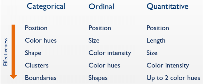
You also need to classify your data. We can put them in these categories: categorical, ordinal, and quantitative. The reason we do this is because different visual components work better for certain kinds of data. For example, scatter plots work well with two pieces of quantitative data, whereas line graphs work best with date ordinal data. However, line charts are horrible for non-ordinal categorical data because they imply continuity. Here are the types of data:
- Categorical – Data that logically belongs together, such as: North America, Europe, and Asia.
- Ordinal – Data that logically belongs together and has a logical sequence: 1st place, 2nd place, 3rd
- Quantitative – Data that defines “how much” of something there is: $1 million in sales, 20° Celsius, 150 defects.
Use the Proper Visualizations
This shouldn’t be based on someone’s preference. There is actually a logical hierarchy of effectiveness based on years of research, studies and psychology. Use the hierarchy with the type of data and avoid common visualization mistakes. For example, applying discrete colors to categorical data is a common mistake people make.
Iterative Design
This is where Agile comes in. Don’t wait till your requirements are 100% complete. Visualizations require an understanding of the end-user’s desired needs. Its difficult to achieve without starting with some sort of proof of concept and building off of it through feedback. This helps to avoid “analysis paralysis” which often occurs if using waterfall or older development methodologies.
Conclusion
There is a lot more information that could be added here, but we will save that for a white paper. Hopefully this short introduction will get you started or get your thought process kicked into gear. This should at least provide a good start to developing quality and effective visualizations.
A good place to start is by downloading Aqua Data Studio, a rich and robust tool for creating dashboards and visualizations based on the concepts outlined here.